Tunnel crossing

Tunnels are favourite locations for graffiti, not only tags and ‘writing’ but also creative — though unofficial –  public artworks. The ephemeral nature of these makes them more interesting than the durable commissioned murals that are sometimes painted or tiled on tunnel walls. However charming or sophisticated the official works might be, they can become boring for people who pass that way day after day.

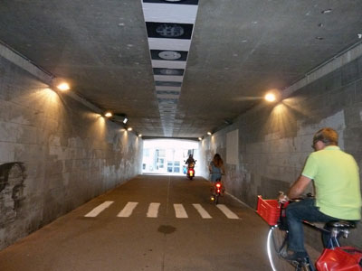
In Antwerp there is a pedestrian tunnel underneath the railway line between Centraal Station and Berchem. It has several artworks painted, pasted or projected on the walls, floor and even the ceiling.

13n-ncP1020988_TunnelRide

Naturally I like the zebra crossing, given my interest in the symbolism of crosswalks. Perhaps, given the amount of bicycle and even motorcycle traffic in the tunnel, the artist had in mind that pedestrians needed assistance to cross safely from one side to the other, should they wish to do so. Or perhaps the artist wanted to encourage people to go against the flow, although going against the flow in this case would only bring you up against a brick wall.

13n-ncP1020983-TunnelWalk

My thanks to Duncan, a fellow participant at the Visual Methods Seminar at the University of Antwerp, for finding this pedestrian crossing for me. Thanks also to Alan for demonstrating the use of the crossing for the photo.
Chicken trail

13n-ncP1020742_ChickenClose

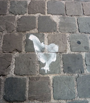
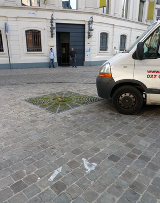
Apart from the Scallop Shell Trail for pilgrims I found another, less permanent trail on the footpaths of Antwerp. On Molenberg Straat these stencilled chickens and arrows led … where?

13n-NCP1020743_ChickenArrow

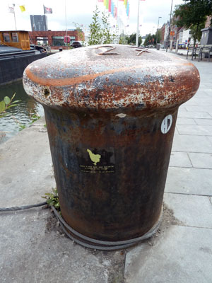
I think I might have found the answer on a sticker attached to a mooring bollard in another part of town. It is advertising ‘Ceci n.est past une galerie – a unique dinner concept’. Apparently this is a nomadic  ‘restaurant’ where a small number of people share a table to eat, converse and view artworks  in a private studio or house. The stencilled chickens I saw must have led to one of these locations. But was it the current one?

13n-ncP1020838_ChickBollard

Chunky body

I am writing this blog post from Antwerp in Belgium, where I am attending a Summer School in Visualising Urban Culture. Before I left Sydney I did a quick scout around some local streets, to catch up on any pavement graffiti I might have missed.

13m-ncP1020566_BodyRun

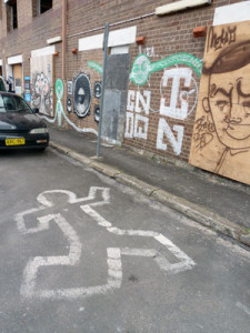
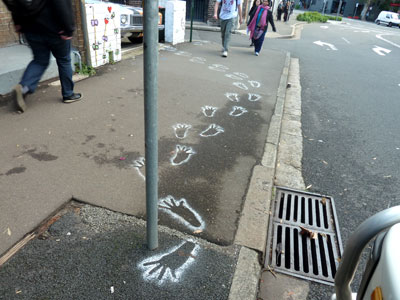
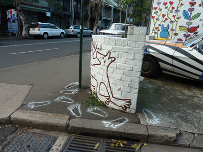
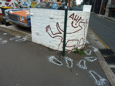
I found this body outline in a back street of Camperdown. A number of graffiti artists have utilized the walls of this closed-down factory building (now being renovated, presumably into desirable inner-city apartments). I don’t know why one of them turned their attention to the asphalt, but I like this chunky body on the road. It exemplifies my arrival in Antwerp. I hit the ground running and have been flat out ever since.

Points and boundaries (Guest spot)

13iP1020383-SurveyPred

Photo: meganix

When I blogged about a chiselled, painted and Post-it noted survey mark recently, I invited Scott Taylor to comment and tell us more about survey marks. Scott is a surveyor who hosts the website Global Surveyors. This is what he had to say:


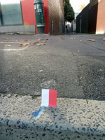
The red and white Post-it is actually called a Red and White!!! We aim our surveying instrument at the centre or join between the two colours, which we have positioned centrally over the survey mark.

There are many marks surveyors use, some placed in kerbs, rocks, trees, or buried under ground (hidden), and all on public record noted on a Deposited Plan.

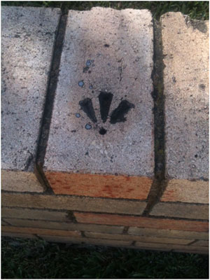
Here are a couple of survey marks I happened to have on my phone. They are  called Drill Hole and Wings. Like the blue mark in your photo, they are used for boundaries and are noted on a plan as being at a corner, or being a certain bearing and distance from a corner. They assist the surveyor to re-establish a boundary corner when that corner has disappeared or been destroyed.

Photo: Scott Taylor

Photos: Scott Taylor

 We paint almost every mark we place. Surveyors have no particular colour. I use whatever is available and feel as though I’m a graffiti artist most of the time.

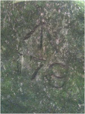
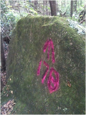
Here is a rock mark from the 1800s, before and after it’s been painted. It’s referred to as a Broad Arrow. For those interested in survey marks there is a great publication called Marking the landscape: a short history of survey marks in New South Wales.

Taylor_BroadArrow1


Photos: Scott Taylor

Photos: Scott Taylor


Imitations of Eternity

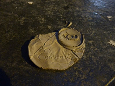
13k-nc-P1020437-EternityCan

Will Coles (aka Numb) is a guerrilla street artist who knows a thing or two about aphorisms. His casts of consumerism’s cast-offs often bear one-word invitations to think deeply about the shallowness of present-day culture. So perhaps it was inevitable that he would eventually appropriate Arthur Stace’s single-word sermon, ‘Eternity’.

13k-nc-P1020439-MonorailCan

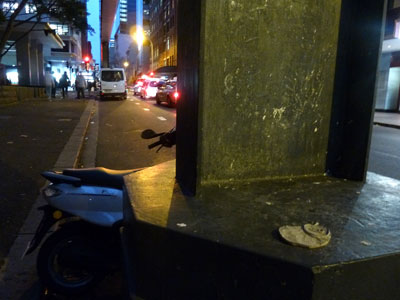
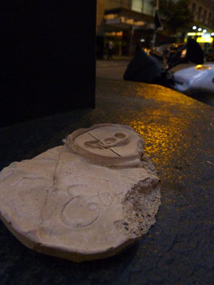
Thanks to my loyal band of spotters, I was able to find and photograph several of Will’s ‘Eternity’ drink cans this weekend. They were stuck to the stanchions of Sydney’s now defunct monorail, a train that went from nowhere to nowhere and connected to nothing. The monorail closed down at the end of June after uglifying the streets of Sydney for 25 years. Most people would say good riddance but Will had apparently found it a great space for his mini-installations. As a farewell gesture he hit it hard with his works last week, and by the time I got down to Pitt Street many of them had been souvenired while others had been damaged, presumably in an attempt to remove them.

13k-nc-P1020418-BrokenCan

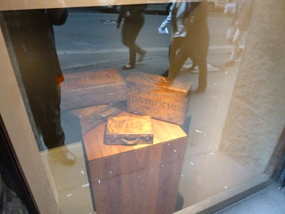
Will Coles is an artist who straddles both the gallery and the street scene. A more dignified example of his work is currently on show at the high end of town, in a window of the Optiver Building in Hunter Street.

13g-nc-P1020201-ColesOptive


(My earlier blog posts about ‘Eternity’ can be found here and here, and Will Coles’s work pops up here, here and here)


Three degrees of permanency

13iJUN29-ncP1020383-SurveyP

Some time in the past this arrow-shaped survey mark has been chiselled into the concrete kerb of Regent Street, Redfern (Sydney). It will last as long as the kerb does. But to make it more visible it has been painted blue. Eventually the paint will be weathered away. Last week there was a man surveying the boundaries of a property that adjoins the pedestrian laneway off Regent Street. So that he could see where the survey mark was through his theodolite, he had stuck a red and white post-it note next to it. The post-it note was probably gone by the next day, blown away by the wind.

I have only presumed that’s what the post-it note was for. I don’t really understand survey marks. I wish I had thought to ask the surveyor about this one. But anyway, I have contacted Scott Taylor at the Global Surveyors website and invited him to comment on this Pavement Graffiti post. According to a blog post by Scott about ‘Interesting survey marks’, surveyors like him are magnetically attracted to survey marks in kerbs, roads and bridges, and drive their friends crazy saying, “Look, there’s a level datum”. Here at Pavement Graffiti we understand this level of fanaticism.

Christian graffiti

13i-ncP1020357-PraiseGodBus

Following on from my earlier post about Eternity, I’ve noticed that someone regularly chalks Praise God! on kerbs in Glebe Point Road (Sydney), often at bus stops. It’s not the only piece of Christian graffiti I’ve come across on the ground, although I have more frequently found graffiti that mocks religion. Photos of these jokes and snide remarks are posted in my Pavement Appreciation gallery.

13i-nc-P1020358-PraiseGodMa

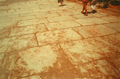
People have used the pavement for affirmation of their Christianity from very early times, as evidenced at the remains of the formerly important Roman city of Ephesus, located in the east of what is now Turkey. Ephesus is mentioned in the Book of Revelations in the Bible. Among the archaeological finds are symbols carved into the paving stones of the Arcadian Way. These symbols are made up of a set of Greek letters that have been interpreted by classics scholars as standing for ‘Jesus Christ Saviour Son of God’.

The following photograph was posted by aaron60 in his Ephesus Travel Page on the Virtual Tourist website. At least two of these segmented circular Christian symbols can be seen.

2231833-Christian_graffiti_


Vale Jeffrey Smart 26 July 1921 – 20 June 2013

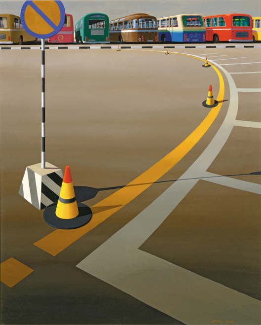
'Bus terminus', Jeffrey Smart, 1973

‘Bus terminus’, Jeffrey Smart, 1973

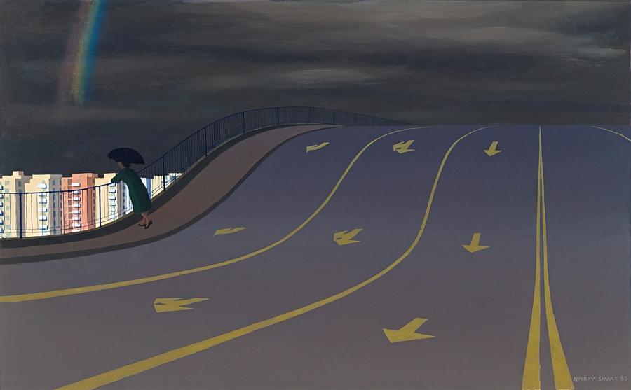
Traffic marks occur frequently in Jeffrey Smart’s precisionist pictures of the built landscape, their sharp outlines and piercing colours marshalling into order the compositions of tarmacs, car-parks and autobahns that he was driven to paint. In his work, wrote Mark Ledbury, we see a celebration of the road marking as a painterly object.

With his depictions of hard-edged and perfect  roads signs on even and unblemished asphalt, Smart drew our attention to a property of the pavement that we might overlook if we only concentrated on the flaws in its pocked, patched and scarred surface. For the fact is that, prosaically functional though the pavement may be, it is an edifice of monumental proportions, stretching horizontally further than the eye can see and intruding on our everyday lives in ways that we barely acknowledge.

In an interview with journalist Janet Hawley, Smart once said that he was happy if the public was stimulated by his work, ‘and if they see Jeffrey Smart paintings everywhere in the urban landscape, it means I’ve helped educate their eyes, so I’ve done them a favour’.

Thank you, Jeffrey Smart.

'The rainbow', Jeffrey Smart, 1965

‘The rainbow’, Jeffrey Smart, 1965

Ledbury, Mark. 2011. Mute eloquence: the art of Jeffrey Smart. Sydney University Museum News (25): 12-14.

Hawley, Janet. 1989. Jeffrey Smart made simple. The Sydney Morning Herald (Good Weekend), 13 May 1989, 14-20.

© Megan Hicks 2013

Eternity revisited

I have talked about ‘Eternity’ before, so please excuse my return to the subject, which has been prompted by two quite different sightings this week.

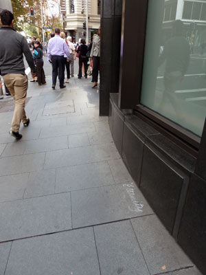
Arthur Stace, ‘The Eternity Man’, stealthily chalked the word ‘Eternity’ on Sydney pavements from the 1930s to the 1960s. Even though Sydney is often accused of being a shallow and superficial city, Sydneysiders still perpetuate the memory of Stace’s one-word warning. Last Monday, for example, I found it chalked on the footpath in Pitt Street near Bridge Street, just round the corner from the Stock Exchange. It was written neatly but the handwriting did not approach Stace’s masterly copperplate.

'Eternity', Pitt Street, Sydney, 2013 (photo by meganix).

‘Eternity’, Pitt Street, Sydney, 2013 (photo by meganix).

If you believe in the afterlife, ‘Eternity’ is a powerful reminder to examine the deeds of your present life to ensure you will enter the kingdom of heaven. It was a sermon by evangelical Baptist, the Reverend John Ridley, that inspired the recently-converted Stace to embark on his footpath mission. “Where will you spend eternity?”, thundered the preacher.

But even for non-Christian Sydneysiders, ‘Eternity’ has resonance. Is it simply that they embrace the novelty of a home-grown eccentric who mysteriously but doggedly left his mark on city streets for over thirty years?

Or is there some deeper feeling involved? Does Stace’s message touch on an unspoken guilt about the kind of legacy Sydneysiders will leave?  In the very centre of the city is Sydney Harbour, so beautiful with its sparkling water and tree-lined coves, that is easy for people to be reminded how this place might have been before empire-building ambitions laid waste the bush and scattered its original inhabitants.

Perhaps I am wrong about this. Perhaps we should not look to cultural commentators like me, or historians, poets and artists, for an interpretation that explains the appeal of ‘Eternity’. Perhaps instead we should look to the manufacturers of facial tissues.

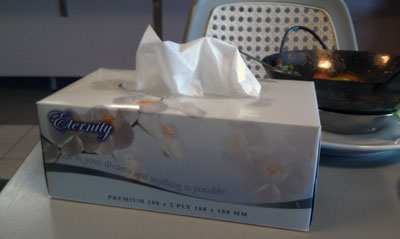
On Friday I lunched at a bowling club ‘bistro’ in Liverpool, a city some 40 km west of the centre of Sydney. Instead of paper serviettes there was a box of ‘Eternity’ brand tissues on each table. These are apparently manufactured in a Sydney suburb and the typography used for the name cannot be a coincidence. So for me it was particularly interesting to read the vacuous message on the box that was meant to complement the inspiring brand name: ‘Pursue in your dreams and anything is possible’.

'Eternity' tissues, 2013 (photo by meganix).

‘Eternity’ tissues, 2013 (photo by meganix).


1 2 3 4 5 6 7 15